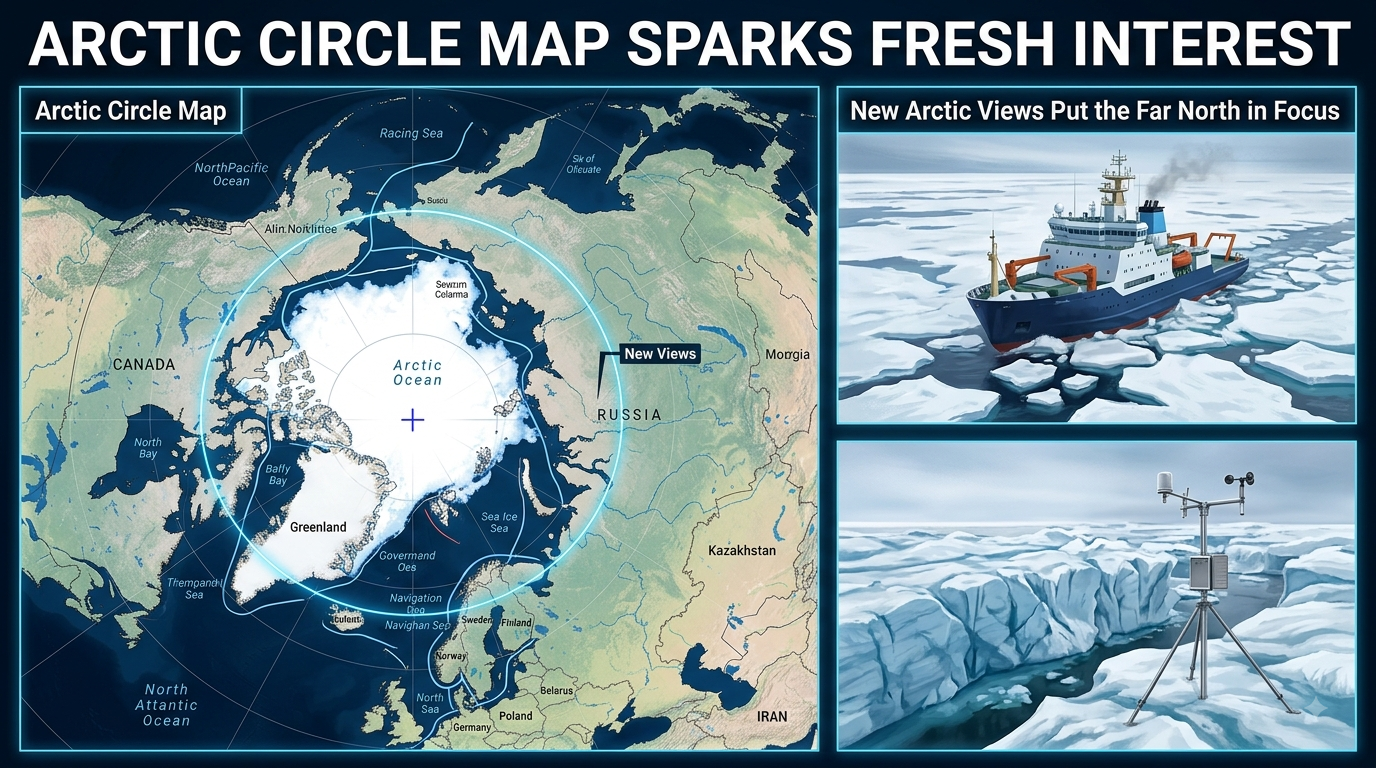
Arctic Circle map searches are drawing fresh attention on Sunday, August 16, 2026, as people look again at the strange northern line that helps explain where the Arctic begins. I keep looking at the map because one simple circle can tell a very big story about ice, daylight, countries, oceans, and life. The line sits at about 66°33′ north latitude, and yes, it looks simple, but there is much more hiding around it.
I opened an Arctic map today and the first thing that caught me was how huge the northern world really feels. The Arctic Circle is not a wall, of course. It is an imaginary line wrapped around Earth. Maps draw it so we can understand the northern polar zone better. North of the line, the Sun can stay above the horizon for a full day during the summer solstice. In winter, the opposite happens, and the Sun can remain below the horizon for a full day. That is where the famous midnight sun and polar night begins to make sense.
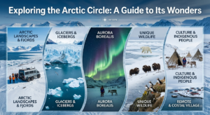
The map itself can look almost too easy. There is the North Pole at the top. Around it is the Arctic Ocean. Then the Arctic Circle sits farther south, making a wide ring around the planet. But when I look closer, the picture gets busy. Canada reaches deep into the Arctic. Greenland sits like a giant frozen island. Russia stretches across a huge part of the northern map. Norway, Sweden and Finland touch the Arctic region too. Alaska also reaches into the far north. Iceland has a special place in many Arctic maps because only a small part of the island lies north of the Arctic Circle.
That is one reason an Arctic Circle map can sometimes confuse people. The Arctic Circle and the Arctic region are not always exactly the same thing. A common geographic definition says the Arctic is the area north of the Arctic Circle. Other scientific and policy definitions can use climate, vegetation, sea ice or other boundaries. So two maps can look different and still both be useful.
The line itself is also not perfectly frozen in one place forever. Earth is tilted, and its orientation changes slowly. Because of this, the exact position of the Arctic Circle shifts a little over time. NOAA notes that its approximate location is 66 degrees 34 minutes north latitude. That tiny change does not suddenly redraw the whole Arctic, but it matters when scientists make very accurate calculations.
I think the most exciting part of the map is what happens with sunlight. Imagine standing right on the Arctic Circle around the June solstice. The Sun can remain visible for 24 hours. It may look like daytime that forgot to end. Move farther north and the strange light lasts longer. Near the North Pole, the story becomes much bigger. There can be roughly six months of continuous daylight followed by roughly six months of continuous night. It sounds like something from a movie, but it is a normal result of Earth’s tilt and movement around the Sun.
Then comes the winter side of the map. The same northern places that enjoy long summer daylight can enter long periods of darkness. I can imagine how different the world must feel there. A clock says morning, but the sky says night. It is not simply a cloudy day. The sunlight itself can stay away for an extended period. This is why Arctic maps are more than geography pictures. They help explain how people, animals and plants live with unusual seasons.
The Arctic Circle map also shows why the Arctic is shared by many nations. There is no single country called the Arctic. Instead, the northern region includes land and waters connected to several countries. Canada and Russia have enormous Arctic territories. Greenland is part of the Kingdom of Denmark. The United States reaches the region through Alaska. Norway, Sweden and Finland also have northern areas inside the wider Arctic zone. Iceland is often included in lists of Arctic states because of its geographic position and connections to the region.
The ocean is another big surprise when looking at a polar map. The Arctic Ocean sits around the North Pole, with land surrounding much of it. Seas and waterways spread around the edges. Greenland is between the Arctic and the North Atlantic world. The Bering Strait links the Arctic Ocean with the Pacific side. Open a map and these places suddenly stop feeling like far-away names. They become connected pieces of one cold northern system.
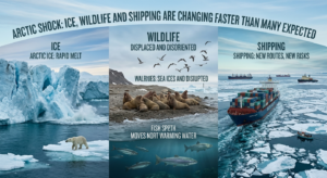
Sea ice makes the map even more interesting. Unlike permanent land, sea ice moves. It grows during the colder season and shrinks during the warmer months. So an Arctic map showing political borders stays mostly stable, while a map showing ice can look very different from one season to another. NASA explains that Arctic sea ice usually reaches its minimum extent in September and its maximum around March.
This changing ice has become a major reason people watch Arctic maps more closely. Scientists use satellite observations and other measurements to track ice conditions. A map can show where ice is concentrated, where open water is appearing, and how the northern environment is changing. I find that part a little shocking because the map becomes almost like a moving picture. The Arctic is not just a frozen place sitting still at the top of the world.
Climate change has added another layer to the story. The Arctic is warming rapidly, and changes in ice, snow and permafrost can affect the wider climate system. The National Snow and Ice Data Center notes that weather at lower latitudes can also be influenced by what happens in the Arctic. So the Arctic Circle map is not only about people who live above a particular line. What happens there can matter much farther south.
The ice also affects travel and shipping discussions. As sea-ice conditions change, attention toward northern sea routes has increased. Ships, governments and researchers watch passages around Russia, Canada and Greenland with growing interest. But an open-looking route on a map does not mean easy travel. Ice, storms, darkness, remote distances and limited infrastructure can make Arctic journeys difficult. The map may look calm, while the real Arctic can be very rough.
The region is also home to animals that seem almost designed for the cold. Polar bears, Arctic foxes, reindeer and many seabirds depend on northern habitats. Walruses rest on sea ice or coastal areas. Whales travel through Arctic waters. Tiny organisms live in the sea and help support larger animals. When ice conditions change, the effects can travel through the food chain. So every new line, color or symbol on an Arctic map can represent something alive.
There is a human story too, and it should not get lost behind the ice pictures. Indigenous peoples have lived across Arctic regions for thousands of years. Their knowledge of weather, animals, sea conditions and seasonal movement is deeply connected with the land. A map made only with borders can miss this human geography. The Arctic is not empty, even when a satellite picture makes it look like a giant white blank.
Modern Arctic maps are becoming more detailed as technology improves. Satellite data can reveal sea ice, clouds, coastlines and changing environmental conditions. Digital maps can layer roads, settlements, shipping paths, research stations and protected areas over the same northern landscape. I can zoom into a place that once looked like a tiny mark and suddenly see rivers, islands and communities. It makes the far north feel less mysterious, but maybe also more fragile.
There is another reason the Arctic map is getting attention this year. On August 12, 2026, a total solar eclipse crossed parts of the Arctic region, including northern Russia, Greenland and Iceland before continuing toward Europe. The event put northern geography in front of millions of eyes, because the eclipse path passed through some of the most remote areas shown on Arctic maps.
That eclipse did not change the Arctic Circle itself. It simply gave the map a dramatic new moment. Suddenly, lines on a screen became places where people were watching the sky turn dark. Scientists, travelers and sky watchers followed the event across a broad path. It was a reminder that the Arctic is not only about cold weather and ice. Space, sunlight and Earth’s movement are part of the story too.
When I look at an Arctic Circle map now, I see several stories at once. And I see a region changing while the world keeps watching.
The simplest map can therefore become a very big news story. It tells us where the Arctic Circle is, but it also asks what the northern world will look like in the years ahead. The line around 66°33′ north may be imaginary, yet the land, ocean, ice and communities around it are very real.
For me, that is the surprising part. I started with a circle on a map. I ended up thinking about the whole planet. The Arctic Circle is only one line, but it marks a place where Earth shows some of its strangest natural tricks. The Sun can stay up all day. Darkness can last for days. Ice can expand and retreat. Maps can change their colors. And the far north keeps giving the world another reason to look closer.
✍️ Written by Vimal Bhagat
🌎 Sharing fresh news, trending stories & interesting updates from around the world.
💙 Read more: arcticcircle.us